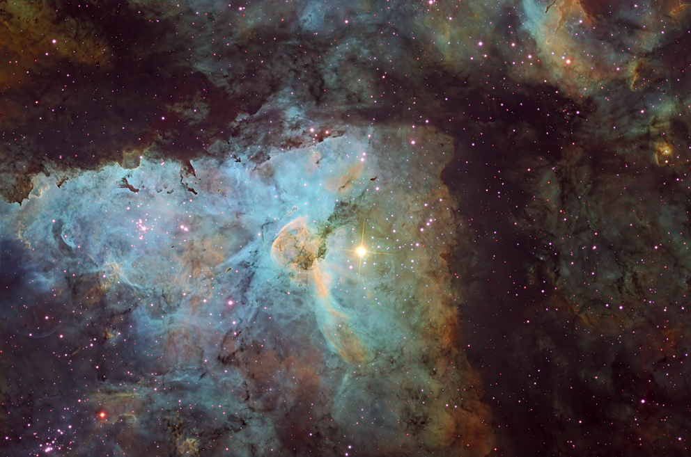
Keyhole: The Keyhole (the keyhole-shaped formation near the center of this image; it looks more like a sea nettle--those horrible stinging jellyfish in the Chesapeake Bay--to me)
is a feature in the Carina Nebula,
a huge, bright diffuse nebula in the constellation Carina, and one of the largest star-forming regions in our galaxy. It is about 8,000 light years from us, while the Keyhole is about 20 light years across.
The bright star just to the right of the Keyhole is the variable star Eta Carinae, an extremely hot and large star, with a mass of at least 100 times that of our Sun (making it one of the most
massive stars in our galaxy), surrounded by the Homunculus Nebula (a small, bright bubble--not visible at this scale--hidden by the glow of the star in this image).
There are a number of bright, young star clusters associated with the Carina Nebula; the bright bluish stars (magenta in the Hubble-palette version) in this field are some of those.
Also of note (at least in the whimsical world), the little globule just above the top of the Keyhole (best seen in the full-resolution version) has been given its own name informally,
"The Finger of God," or "God's Birdie." This Hubble photo is even clearer
than mine (imagine that!) in showing why this little globule has acquired that moniker. This "little globule" is about 2 light years across.
The field is presented here in three versions:
a false-color version using the "Hubble palette"; a more standard true-color version, and a grayscale version constructed from a blend of the narrowband data (click on the image to toggle between the three versions, waiting long enough for large files to download).
The Hubble site explains its use of the "Hubble palette": "The final image depicts red light from hydrogen atoms as green, red light from sulfur ions (sulfur atoms with one electron removed)
as red, and green light from doubly-ionized oxygen (oxygen atoms with two electrons missing) as blue. These color reassignments enhance the level of detail visible in the image,
because otherwise the red light from hydrogen and that from sulfur would be hard to tell apart. In the final [Hubble palette] image, the blue-green haze indicates light from hydrogen and oxygen."
In comparing the two color images I present, there's a lot more structure detail to be seen in the Hubble palette version than in the (relatively monochromatic) "true-color" version, in large part
because the sulfur emissions are differentiated from the hydrogen emissions in the Hubble palette version.
The mix of bluish and reddish hues in the "true-color" version, and the dominance of the greenigh and bluish in the Hubble palette version, both show how much of the light being emitted in this frame is
being emitted by hydrogen and oxygen atoms.
Copyright 2015 Mark de Regt